Blog
Understanding Color Psychology in Graphic Design
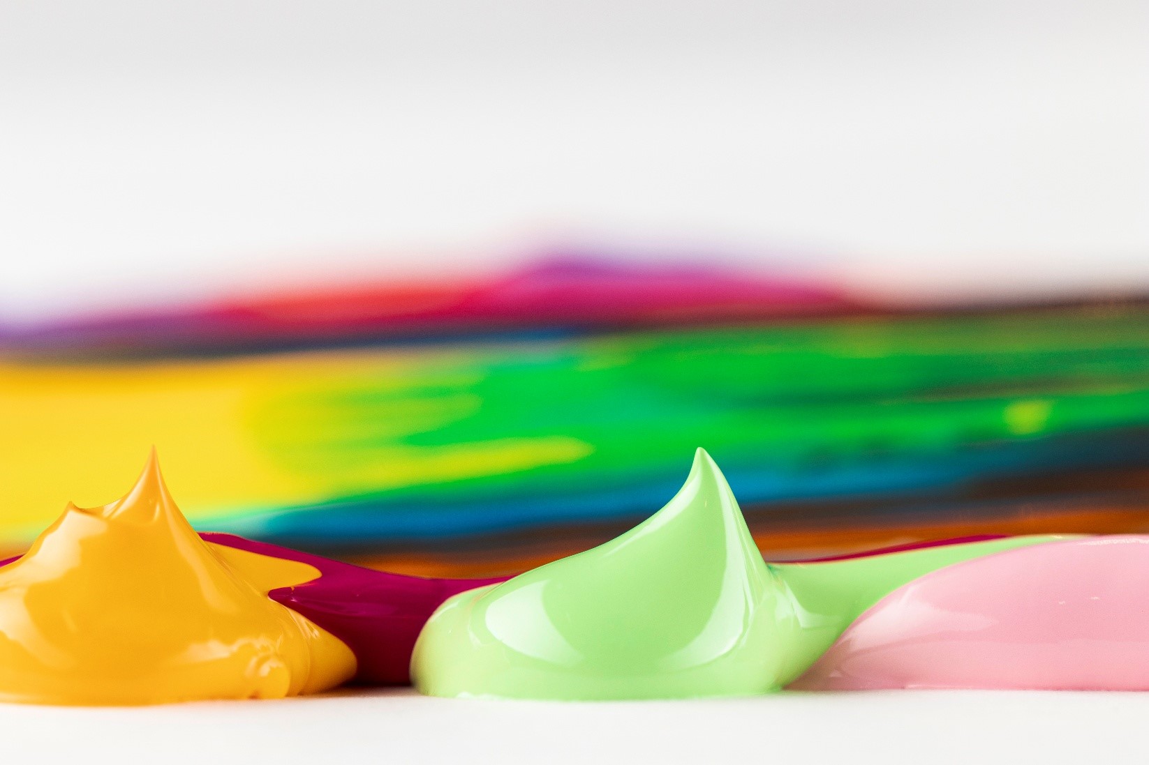
Color is the main tool for graphic design. It communicates mood, evokes emotions, influences perception, and drives consumer behaviour. The study of how colors affect people psychologically is known as color psychology, and in graphic design, it plays a crucial role in conveying messages and creating visually compelling compositions.
Whether you’re designing a logo, website, advertisement, or product packaging, understanding color psychology helps you create more effective and intentional designs. This article explores the principles of color psychology, the emotional effects of specific colors, cultural associations, and practical tips for using color in graphic design.
 Why Color Matters in Design?
From the moment we see a design, color is the first thing that catches our eye. Before reading the content or processing the layout, our brains react to color. Studies show that color can increase brand recognition by up to 80% and influence up to 90% of initial impressions. It helps communicate tone, mood, and purpose without words.
In graphic design, color is used strategically to:
- Attract attention
- Evoke specific emotions
- Guide user behavior
- Convey brand personality
- Enhance readability and user experience
What Is Color Psychology?
Color psychology explores how different colors affect human behavior, thoughts, and emotions. It’s a blend of psychology, art, and cultural symbolism, often used in marketing and branding to affect consumer decision-making.
Colors trigger both emotional and physiological responses. For example:
- Red has the power to quicken the heartbeat and trigger a feeling of urgency or alertness.
- Blue can promote calmness and trust.
- Yellow can evoke happiness and energy.
Designers leverage these associations to reinforce branding, guide user actions, and create specific impressions.
 The Emotional Impact of Colors
Each color has its own psychological properties. Below is an overview of common colors and their emotional associations in graphic design:
- Red
- Emotions: Passion, excitement, urgency, energy, power, love
- Usage: Often used in call-to-action buttons, sales promotions, food and beverage branding (e.g., Coca-Cola, KFC)
- Tips: Use red sparingly; too much can be overwhelming or signal danger.
- Blue
- Emotions: Trust, calmness, professionalism, security, peace
- Usage: Frequently seen in tech, finance, and healthcare brands (e.g., Facebook, LinkedIn, PayPal)
- Tips: Ideal for conveying reliability and stability.
- Yellow
- Emotions: Optimism, energy, warmth, attention-grabbing
- Usage: Used in brands targeting youth or positivity (e.g., McDonald’s, Snapchat)
- Tips: Best used in moderation due to high brightness.
- Green
- Emotions: Growth, health, tranquillity, nature, balance
- Usage: Popular with eco-friendly, wellness, and financial brands (e.g., Whole Foods, Spotify)
- Tips: Works well for brands wanting to promote sustainability or harmony.
- Orange
- Emotions: Fun, enthusiasm, creativity, friendliness
- Usage: Suitable for entertainment and youth-oriented brands (e.g., Fanta, Nickelodeon)
- Tips: Combines the energy of red with the cheerfulness of yellow.
- Purple
- Emotions: Luxury, wisdom, mystery, spirituality
- Usage: Often used for premium or beauty products (e.g., Cadbury, Hallmark)
- Tips: Darker purples are more sophisticated; lighter purples feel more romantic.
- Black
- Emotions: Sophistication, power, elegance, formality
- Usage: Used in luxury, fashion, and minimalist design (e.g., Chanel, Nike)
- Tips: white or metallic colors are mostly used to enhance elegance and refinement.
- White
- Emotions: Purity, simplicity, cleanliness, clarity
- Usage: Common in tech, healthcare, and minimalist designs (e.g., Apple)
- Tips: Excellent for creating space and contrast.
- Pink
- Emotions: Romance, youth, femininity, softness
- Usage: Seen in beauty, fashion, and children’s brands (e.g., Barbie, Victoria’s Secret)
- Tips: Lighter pinks feel delicate; brighter pinks add boldness.
- Brown
- Emotions: Stability, earthiness, comfort, reliability
- Usage: Often used in organic or rustic designs (e.g., M&Ms, Hershey’s)
- Tips: Works well in natural or vintage-themed branding.
Cultural and Contextual Variations
Color meanings can vary widely between cultures and contexts. For example:
- In Western culture, white color is the symbol of purity.
- Red is associated with danger in the West but good fortune in Chinese culture.
It’s important for designers working in global or multicultural markets to research and respect these variations to avoid miscommunication.
Role of Color in Branding
Color plays a vital role in brand identity. According to research:
- Color can enhance brand recognition by as much as 80%.
- People make subconscious judgments within 90 seconds of seeing a product, and up to 90% of that assessment is based on color.
Brands carefully choose color palettes to reflect their personality:
- Coca-Cola uses red to evoke excitement and stimulate the appetite.
- Apple uses white and silver to highlight simplicity and innovation.
- Starbucks uses green to convey calmness and sustainability.
Consistency in color usage across all platforms—logos, websites, packaging—strengthens brand recall and trust.
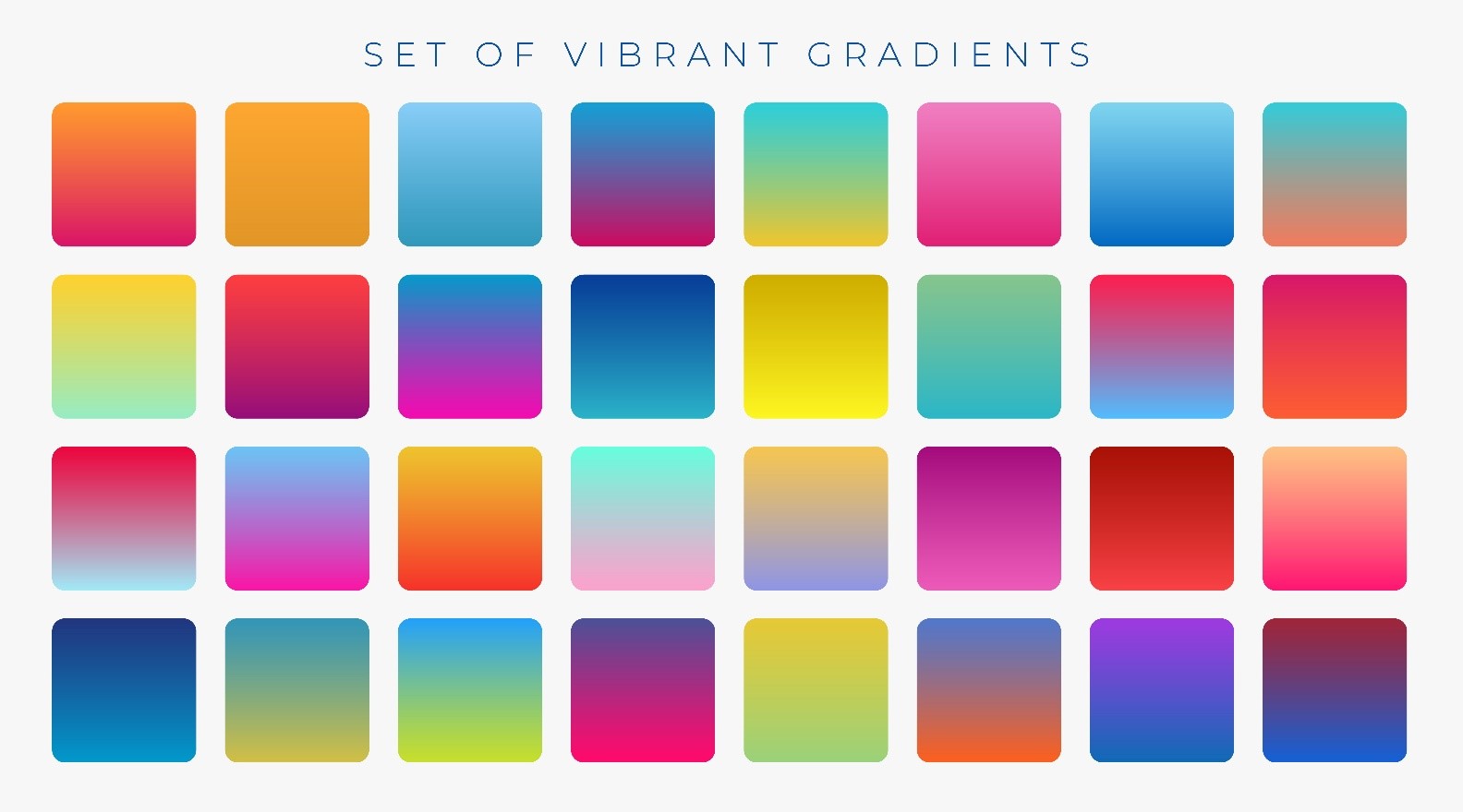
Color Harmony and Design Principles
Using color effectively in graphic design isn’t just about picking the right color—it’s about combining colors harmoniously. Here are a few principles:
- Complementary Colors (Red, green)
• Colors positioned opposite in the color wheel
• Offers a strong contrast, ideal for emphasizing key elements - Analogous Colors (blue, blue-green, green)
• Colors placed adjacent to the color wheel
• Deliver a smooth, unified look that feels naturally balanced and pleasing - Triadic Colors (Red, yellow, blue)
• Colors are evenly placed in the color wheel
• Provide vibrant contrast while maintaining balance
- Monochromatic Colors
- Variations of a single hue
- Simple, clean, elegant
When choosing color schemes, consider contrast (for readability), dominance (to guide visual hierarchy), and balance (to avoid overwhelming the viewer).
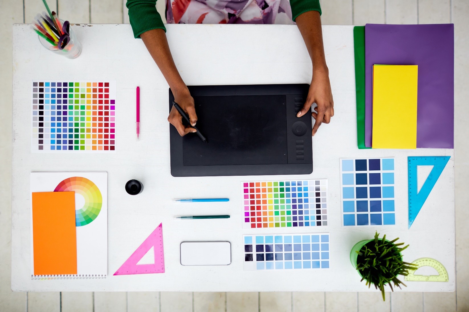 Practical Tips for Designers
- Know your audience: Consider age, culture, gender, and emotional triggers.
- Start with emotion: Choose a color palette based on the feeling you want to evoke.
- Limit your palette: Too many colors can dilute your message. Stick to 2-4 main colors.
- Use tools: Platforms like Adobe Color, Colors, and Canva offer helpful palettes and combinations.
Conclusion
Color psychology is a powerful yet often underestimated element of graphic design. By understanding how colors influence perception and emotion, designers can craft visuals that are aesthetically pleasing and strategically impactful.
Each hue holds psychological weight, from evoking trust with blue to creating excitement with red. Color can transform designs into memorable and persuasive experiences when applied thoughtfully and in harmony. Mastering this language of color helps designers communicate more effectively and connect more deeply with their audience.
Beside this information if anyone wanted to upgrade their skill in the related domain than you must go for Advanced Diploma in Graphic & Web Design course from Leher School of Design (Delhi) which is one of the best and recommended for their courses
Leave a Reply
You must be logged in to post a comment.