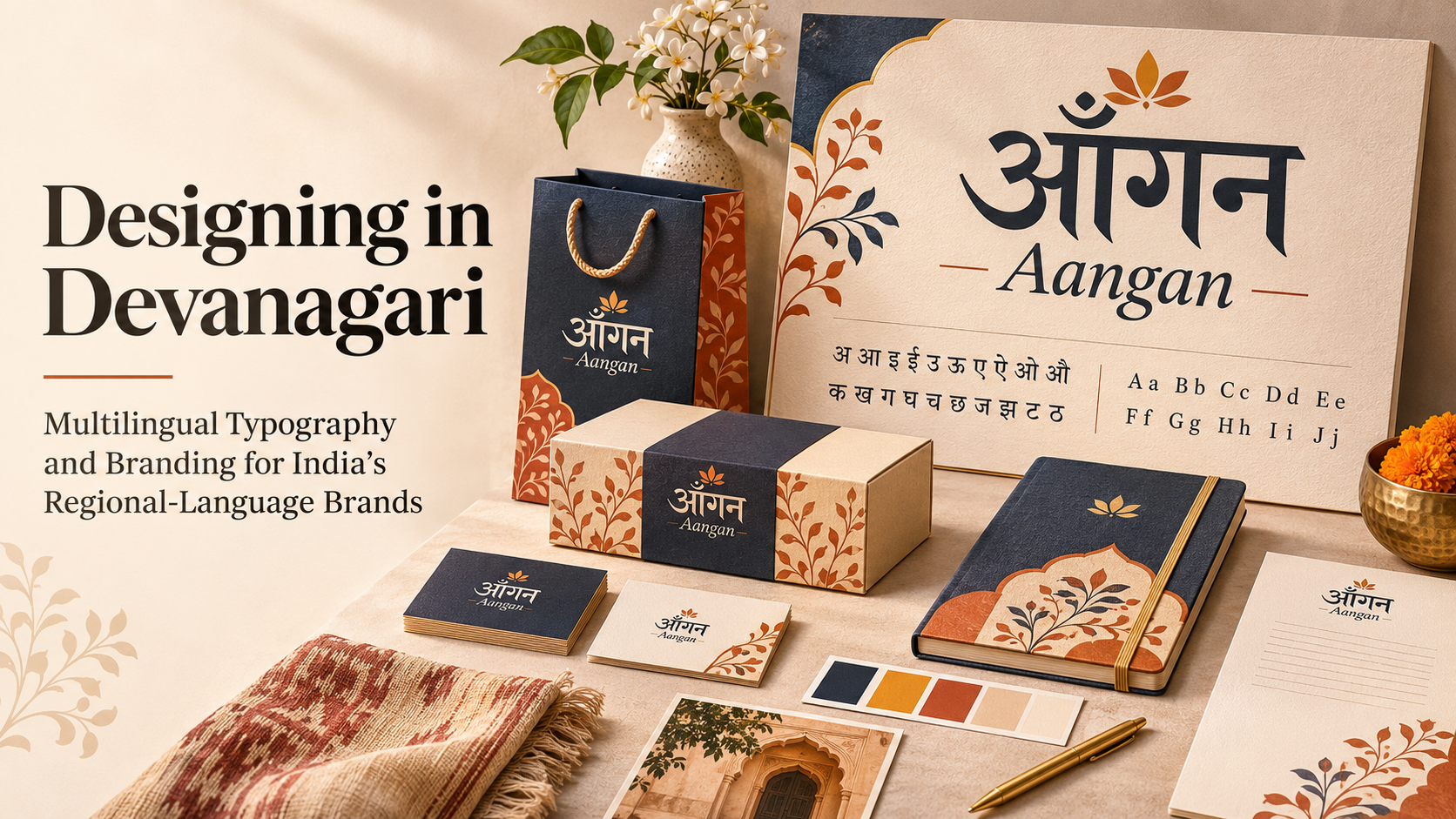
Designing in Devanagari: Multilingual Typography and Branding for India’s Regional-Language Brands
Walk through a busy Indian market and you will notice something that makes the country’s visual landscape distinctive. Shop signs, food packaging, advertisements and storefronts communicate through a combination of English and regional languages. A product may display its name in Hindi, a restaurant may use Marathi lettering, and a digital campaign may adapt its message for audiences across different states.
These choices are more than translations. They are important parts of graphic design and brand identity.
As Indian businesses communicate with audiences who use different languages, designers face an interesting challenge: how can one brand maintain a recognisable visual identity while expressing itself through multiple writing systems?
Devanagari typography offers an important starting point for understanding this challenge. Used for languages including Hindi and Marathi, the script has its own structural characteristics, visual rhythm and typographic traditions.
For aspiring graphic designers, learning to work with Devanagari alongside English typography opens opportunities in branding, packaging, advertising, editorial design and digital communication.
The challenge is not simply to replace English words with Hindi text. It is to design communication that respects the language, remains readable and feels consistent with the brand.
What Is Devanagari Typography?
Devanagari typography is the design and arrangement of text written in the Devanagari script.
Devanagari is used to write several languages, including Hindi, Marathi, Nepali and Sanskrit. Although these languages share a writing system, their vocabulary, linguistic conventions and cultural contexts are not identical.
The script has a different visual structure from the Latin alphabet used in English.
In Devanagari, consonant letters generally carry an inherent vowel sound, while vowel signs and other marks modify how syllables are written and pronounced.
One of its most recognisable features is the shirorekha, the horizontal headline that runs across the tops of many letters and may connect them within words.
Consider the word भारत, meaning India.
Its visual identity comes not only from the individual characters but also from the connected headline, proportions and overall rhythm of the word.
Other characteristics include:
- Matras, or vowel signs, positioned around consonants
- Conjunct forms created through combinations of consonants
- Characters with marks extending above or below the main letterforms
- Distinctive letter proportions and internal spaces
- Script-specific spacing and text-rendering requirements
These characteristics make Devanagari typography a specialised design discipline rather than a direct adaptation of English lettering.
Understanding its structure is essential before attempting to create a custom Hindi logo, bilingual packaging or regional-language digital interface.
Why Multilingual Branding Matters in India
India’s linguistic diversity creates a unique design environment.
A brand may communicate in English for one audience, Hindi for another and Tamil, Bengali, Gujarati or other languages in different regions.
Importantly, these languages do not all use Devanagari. Tamil, Bengali, Gujarati, Telugu and many other languages have their own writing systems.
This means multilingual branding requires designers to understand both language and script.
Connecting With Local Audiences
Language can influence how familiar and approachable a brand feels.
A business communicating in the language its customers use regularly may make product information and advertising messages easier to understand.
For example, a neighbourhood food business in North India might choose Hindi-first packaging, while a regional campaign in Maharashtra could use Marathi prominently.
The appropriate approach depends on audience research rather than assumptions about what every customer prefers.
Expressing Regional Identity
Typography can communicate cultural character through letterforms, composition and visual references.
A regional sweets brand may use expressive lettering inspired by traditional sign painting, while a contemporary financial service may choose clean, restrained typography.
Both can use Indian languages without relying on the same visual style.
Building Consistency Across Markets
A brand operating across different states needs to remain recognisable even when its language changes.
Its logo structure, colours, typography, imagery and layout can provide visual continuity.
The goal is to create a flexible identity system in which regional communication feels natural without making each language version appear to belong to a different company.
1. Understanding the Structure of Devanagari Letterforms
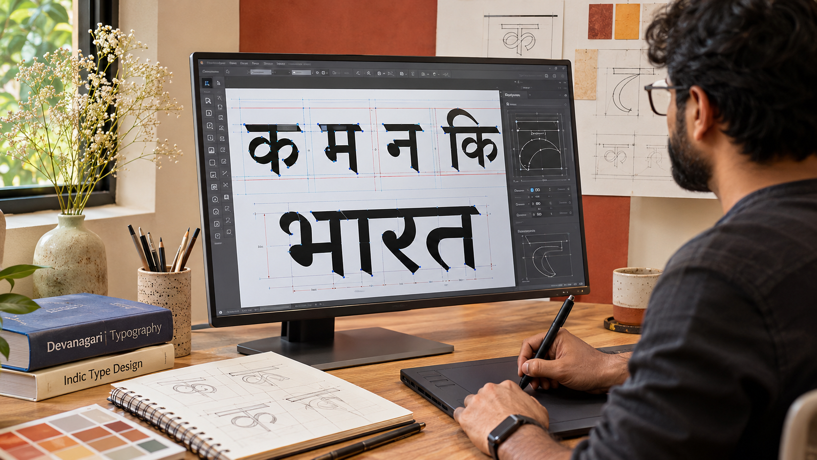
Before designing with Devanagari, graphic designers need to understand how the script works.
The structure of a writing system influences almost every typographic decision, from choosing a typeface to arranging headlines.
The Shirorekha
The shirorekha is the horizontal line running across the top of many Devanagari letters.
It creates a strong visual rhythm and contributes to the script’s recognisable appearance.
Designers experimenting with display lettering may adjust the treatment of this line, but excessive modification can affect character recognition.
In branding, the aim should be to develop a distinctive visual treatment while preserving the readability of the name.
Matras and Their Placement
Matras are dependent vowel signs that appear in different positions relative to consonants.
Some extend above, below, before or after the main consonant form.
For example, in the word किरण, the vowel sign in कि appears visually to the left of the consonant.
This is one reason Devanagari text cannot be designed or manipulated exactly like a sequence of independent Latin letters.
Designers must allow sufficient space for these marks, particularly when creating compact logos or small digital text.
Conjunct Characters
Devanagari frequently uses consonant combinations that produce distinctive joined or modified forms.
Examples include combinations seen in words such as शक्ति, प्रगति and लक्ष्य.
A designer who does not understand these forms may accidentally introduce awkward spacing or incorrect letter construction.
The Importance of Proper Rendering
Modern digital typography uses Unicode text and shaping technologies that determine how characters combine and appear.
For example, supported OpenType features help produce appropriate consonant forms and position marks correctly.
Designers should use fonts and software that support Devanagari rendering rather than manually separating or reconstructing complex text.
Technical knowledge is especially important when adapting typography for websites, applications and animated graphics.
2. Pairing Devanagari and English Typography
One of the most common challenges in multilingual branding is combining Devanagari and Latin typography within the same visual identity.
A bilingual design may feature a Hindi brand name, an English tagline and additional product information in both languages.
Selecting two attractive fonts is not enough. The typefaces must work together.
Match Visual Personality, Not Just Font Size
A bold geometric English typeface may look disconnected from an expressive calligraphic Devanagari font.
Designers should compare characteristics such as:
- Stroke thickness
- Overall proportions
- Visual weight
- Letterform contrast
- Curves and terminals
- Density and spacing
- Formal or informal personality
For example, a contemporary technology brand might use restrained sans-serif typography in both scripts.
A heritage-inspired lifestyle brand may instead explore more expressive lettering, provided the text remains readable.
Balance the Two Scripts
Two fonts set at the same numerical size may not appear equally prominent.
Devanagari includes marks above and below the main characters, while Latin typography is often evaluated through features such as cap height and x-height.
Designers should therefore balance scripts visually rather than relying only on identical point sizes.
Allow Appropriate Line Spacing
Devanagari text may need additional vertical space to accommodate matras and other marks.
Tightly spaced lines can become uncomfortable to read or cause marks to collide.
The correct line spacing depends on the font, size and composition and should be tested rather than determined through one universal setting.
Useful Typeface Options
Designers exploring multilingual projects can study type families such as:
- Noto Sans Devanagari
- Noto Serif Devanagari
- Mukta
- Hind
- Tiro Devanagari Hindi
These offer different visual directions and varying levels of script and language support.
Google’s documentation of the Mukta type project provides an interesting example of how a coordinated visual grammar can connect multiple writing systems without forcing them to become identical.
The important lesson is that successful font pairing preserves the characteristics of each script while creating a shared visual identity.
3. Designing Bilingual and Multilingual Brand Logos
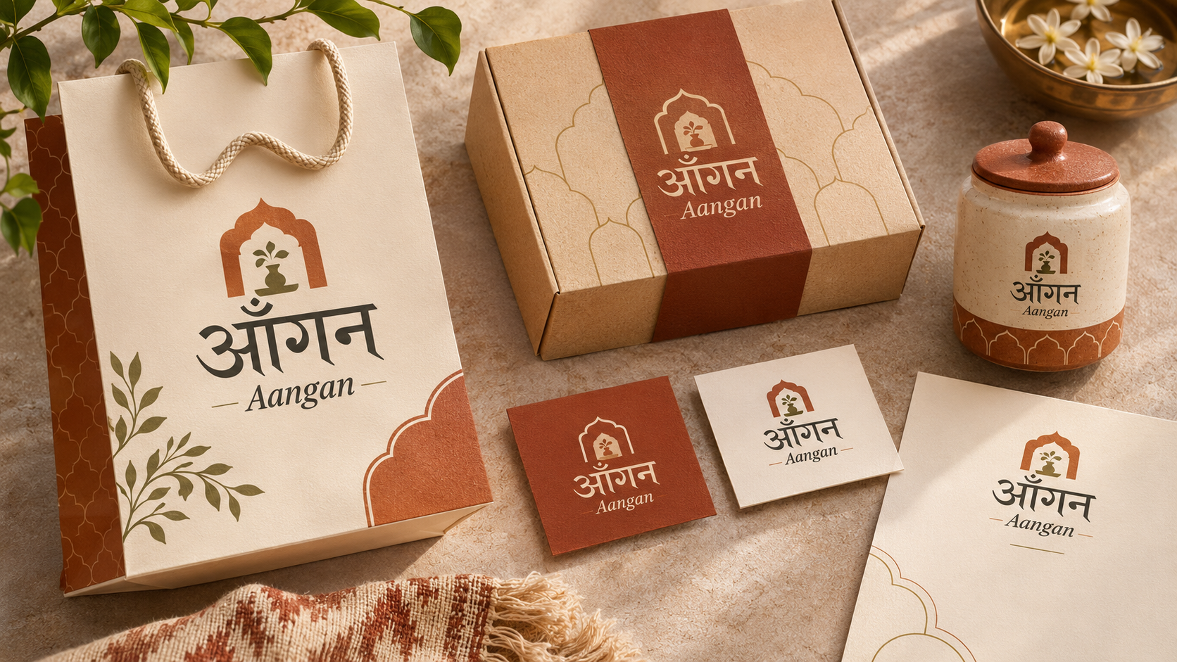
A multilingual logo should be treated as a design system rather than a collection of translated words.
Consider a hypothetical Indian homeware brand called Aangan, written in Hindi as आँगन.
The brand may want to use its English name for national online communication and its Hindi name for selected packaging and retail materials.
A designer could explore several approaches.
Separate Language Versions
The brand could maintain one English wordmark and one Devanagari wordmark.
Both versions would use coordinated proportions, visual weight and colour.
This provides flexibility when different audiences require different language presentations.
A Bilingual Logo Lockup
The English and Devanagari names could appear together in a controlled arrangement.
One script may be positioned above the other or placed alongside it.
The designer must consider hierarchy, spacing and the relative importance of each name.
A Shared Symbol With Different Wordmarks
A common graphic symbol can remain unchanged while the accompanying wordmark changes language.
This approach can be useful for brands operating across multiple regional markets.
The symbol provides continuity, while the typography accommodates local communication.
Custom Devanagari Lettering
For a distinctive identity, designers may develop custom lettering inspired by the brand’s personality.
However, decorative experimentation should never compromise correct letterforms or make the name difficult to read.
A successful multilingual logo system should include clear rules for scale, minimum size, colour, spacing and permitted language combinations.
4. Regional-Language Branding Beyond Translation
One of the biggest mistakes in multilingual branding is assuming that translation alone is enough.
A brand message may be grammatically correct but still sound unnatural or inappropriate for its audience.
Designers need to distinguish between translation, transliteration and localisation.
Translation
Translation expresses the meaning of a message in another language.
For example, an English campaign about everyday freshness might require a Hindi message communicating the same idea naturally.
The translated sentence may be longer or shorter than the original.
Transliteration
Transliteration represents the sounds of a word using another writing system.
Writing the hypothetical brand name Aangan as आँगन is an example of representing the name across scripts.
Transliteration does not necessarily translate the meaning of the word.
Localisation
Localisation adapts communication to the language, cultural context and expectations of a particular audience.
It may involve changes to wording, imagery, examples, design hierarchy or the tone of the message.
A campaign suitable for one regional audience may need more than a direct translation to work effectively elsewhere.
For graphic designers, this means collaborating with language specialists and local reviewers whenever necessary.
The final design should feel natural to its intended audience rather than appearing to be an English layout with different text inserted.
5. Devanagari Typography in Packaging Design
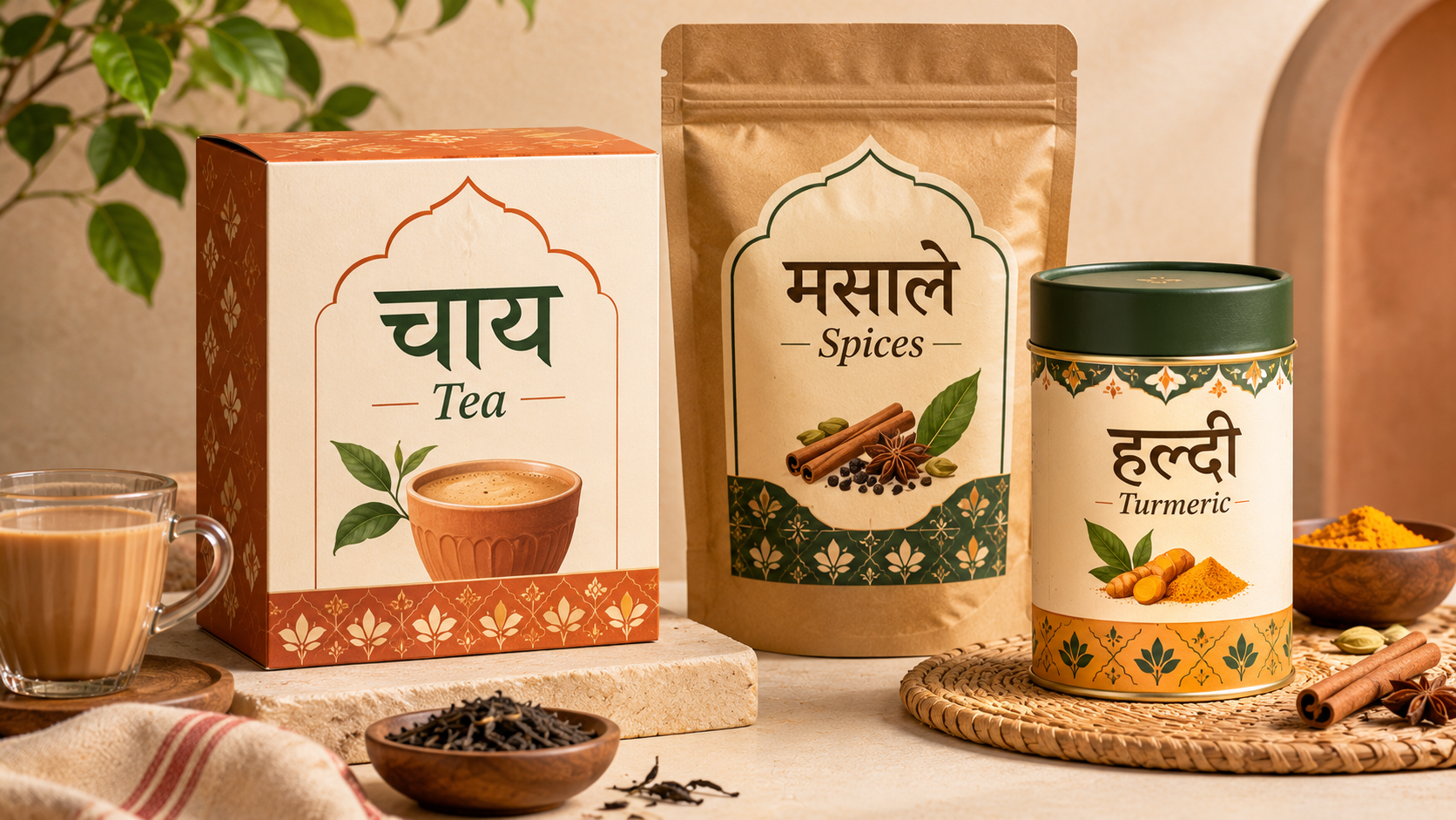
Packaging is an important application of multilingual graphic design in India.
Products may need to communicate brand names, flavours, ingredients, directions and other information to customers using different languages.
This creates both creative opportunities and practical constraints.
Establish a Clear Information Hierarchy
A bilingual package should make it easy to identify the product and understand essential information.
Designers need to decide which language takes priority based on the intended audience and applicable labelling requirements.
A clear system may distinguish the brand name, product description, variant and supporting details without overcrowding the package.
Avoid Overcrowded Layouts
Simply adding another language to an existing label can create visual clutter.
Devanagari and English text may occupy different amounts of space.
Designers should plan flexible layout areas and allow enough room for each version rather than shrinking text until it fits.
Use Typography as a Brand Element
Regional-language lettering can become a distinctive part of the packaging identity.
For example, a contemporary Indian tea brand might use expressive Hindi lettering as the main visual element while maintaining a restrained colour palette and clear supporting information.
The result can feel culturally relevant and modern without requiring elaborate decorative graphics.
Test Packaging at Actual Size
A composition that appears readable on a large computer screen may fail when printed on a small carton or label.
Designers should test the finished typography at realistic sizes and under typical viewing conditions.
LSOD’s article on packaging design trends in India explores how typography, cultural identity and packaging systems work together in contemporary branding.
6. Multilingual Typography for Websites and Mobile Applications
Digital communication introduces additional challenges because typography must work across devices, screen sizes and software environments.
A multilingual website may display English navigation, Hindi product descriptions and region-specific campaign messages.
Its typography must remain readable and technically reliable.
Choose Fonts With Appropriate Script Support
Not every font includes Devanagari characters or the glyph forms needed for particular languages.
If a selected font lacks support, a browser or application may substitute another font.
That substitution can change the visual appearance of the page.
Designers and developers should test the intended font and fallback fonts across devices.
Maintain Responsive Layouts
A mobile interface has limited space for navigation labels, buttons and headings.
Translated phrases may require different widths, and Devanagari characters need adequate vertical clearance.
Instead of forcing every language into identical fixed-width text containers, designers should allow layouts to adapt.
Support Correct Language Identification
Web developers should identify content languages appropriately in HTML.
For example, Hindi content may use the language tag hi, while Marathi content may use mr.
Correct language information can support appropriate processing and accessibility tools.
The precise implementation should be coordinated with developers rather than treated solely as a visual design task.
Consider Readability and Accessibility
Essential interface information should use legible type sizes, appropriate contrast and clear hierarchy.
Decorative typography may work for a promotional headline, but navigation, forms and instructions generally benefit from more restrained treatment.
Designers should also test real text with native or proficient readers.
An interface is not successful simply because its translated words fit inside the design.
7. Designing Regional-Language Signage and Advertising
Devanagari typography is also important in physical communication.
Retail signs, outdoor advertisements, educational institutions, transport environments and public-facing spaces may use bilingual or multilingual information.
Readability From a Distance
Large signage requires different typographic decisions from a mobile application.
Designers must consider viewing distance, lighting, contrast, letterform clarity and surrounding visual distractions.
Overly elaborate lettering may create a strong impression but become difficult to read quickly.
Language Hierarchy
In multilingual signage, the order and prominence of languages should reflect the users’ needs and any applicable requirements.
Designers should not assume that one language must always dominate every communication.
A neighbourhood retail sign and a transport information board may require very different approaches.
Consistent Visual Systems
Typography, colour, symbols and spacing should remain predictable across signs.
This consistency becomes especially important in environments where visitors need to find information quickly.
Readers interested in this application can explore LSOD’s article on wayfinding and signage design.
The broader lesson is that regional-language typography must combine visual expression with functional communication.
8. Common Mistakes in Devanagari and Multilingual Design
Working across scripts requires attention to details that may be unfamiliar to designers trained primarily in English typography.
Using Decorative Fonts Without Checking Readability
A highly stylised Devanagari font may look attractive in isolation but become difficult to understand when used for a long headline or small product label.
Always test the design with actual text and realistic viewing conditions.
Applying Latin Letter-Spacing Techniques Directly
Devanagari contains consonant combinations and marks that must remain connected or positioned correctly.
Artificially separating characters can disrupt the script’s natural structure.
Designers should use appropriate typography controls rather than treating every visible element as an independent letter.
Ignoring Language-Specific Differences
Hindi and Marathi share Devanagari, but this does not make their written communication interchangeable.
A regional branding project should use appropriate language expertise and check the actual audience requirements.
Relying on Automated Translation Without Review
Automated translations can be useful for preparing drafts, but they may produce awkward wording or fail to capture local context.
Brand names, slogans and customer-facing instructions should be reviewed by qualified language users.
Creating Inconsistent Logo Versions
A bold English wordmark and an unrelated thin Devanagari version may weaken brand recognition.
The two versions should feel connected through deliberate visual decisions.
Failing to Test Print and Digital Outputs
A design may render correctly in one application but change when exported, printed or displayed on another device.
Review the final output for missing glyphs, broken conjuncts, incorrect mark placement and unexpected font substitutions.
9. Building a Multilingual Brand Identity System
A successful multilingual identity requires more than one good logo.
It needs a coordinated set of guidelines that designers can apply across different communications.
Define the Brand’s Visual Personality
Start with the brand strategy.
Is the business contemporary, traditional, playful, premium or practical?
These qualities should influence typography in every language.
Develop Script-Specific Typography Rules
Document the approved typefaces and their appropriate uses.
The system may include separate recommendations for:
- Brand wordmarks
- Headlines
- Body text
- Packaging information
- Digital interfaces
- Signage
- Advertising campaigns
Each script may need its own size and spacing adjustments to achieve visual consistency.
Define Language Hierarchy
Specify how different languages appear in particular contexts.
A bilingual retail sign may use equal prominence, while a region-specific campaign may favour the local language.
These decisions should come from audience needs and communication objectives.
Establish Layout Flexibility
Design systems should accommodate differences in text length and letterform structure.
A flexible grid, adaptable text containers and carefully planned negative space make multilingual design easier to maintain.
Document Approved Usage
A multilingual brand guideline can include examples of correct and incorrect applications, font details, logo variations and sample layouts.
This reduces the risk of different teams creating inconsistent versions of the same identity.
The objective is to create a system that protects the brand’s personality while giving every language the space it needs.
10. The Role of AI and Digital Tools in Regional Typography
Digital design tools have made multilingual content production more accessible.
AI-assisted systems may help generate initial translations, explore campaign concepts or create layout variations.
However, Devanagari typography requires particular care.
Generated text may contain incorrect characters, malformed conjuncts or inconsistent spelling. Image-generation systems can also struggle to reproduce complex scripts reliably.
Designers should therefore avoid treating automatically generated lettering as final production-ready typography.
A more dependable workflow involves using verified Unicode text, supported typefaces and professional design software.
Custom logotypes can be developed through vector drawing and type-design methods, but the underlying letterforms should be checked by people familiar with the script.
Tools such as Adobe Illustrator, Figma and web-design applications can support multilingual workflows when the relevant text-rendering and font features are available.
AI can assist with exploration, but accurate language, cultural judgement and typographic quality still require human attention.
11. How Graphic Design Students Can Practise Multilingual Branding
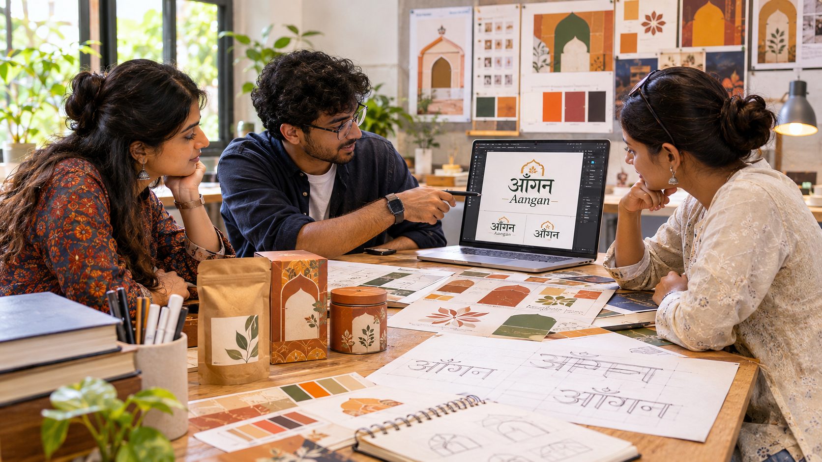
For students, multilingual branding offers an opportunity to combine cultural research, typography, visual identity and real-world communication.
A strong portfolio project could involve designing a bilingual identity for a hypothetical Indian brand.
Step 1: Select a Brand Concept
Choose a fictional café, handmade products business, regional food brand or cultural organisation.
Define its audience, purpose and personality.
Step 2: Research the Languages and Scripts
Identify which languages the brand genuinely needs.
Study the letterforms, typographic conventions and visual communication preferences relevant to those audiences.
For a Hindi–English brand, examine examples of both Devanagari and Latin typography.
Step 3: Create Typography Experiments
Explore different typefaces, letter proportions and visual weights.
Test how the brand name appears in each script.
Compare complete words rather than isolated letters.
Step 4: Develop the Brand Identity
Create a logo system that includes appropriate language variations.
Build a coordinated palette, supporting typography, graphic elements and layout structure.
Step 5: Apply the Identity
Test the system across several applications:
- Product packaging
- Retail signage
- Social-media posts
- Mobile website screens
- Promotional posters
- Business stationery
The visual identity should remain recognisable across every application.
Step 6: Conduct Readability Testing
Ask proficient readers of the target language to review the spelling, typography and overall clarity.
Test the design at different scales and collect feedback on its visual personality.
Step 7: Prepare a Portfolio Presentation
Document the research, initial sketches, font choices, design explorations, final identity and real-world applications.
Explain why each typographic decision was made.
Students interested in branding, typography, visual communication and digital design can explore the Diploma in Graphic & Web Design at Leher School of Design.
The course includes foundational areas such as typography, colour theory, visual communication, branding and web design that can support projects involving multilingual visual identities.
12. The Future of Regional-Language Branding in India
As brands serve audiences across India’s different linguistic communities, multilingual communication will remain an important consideration in graphic design.
Digital commerce, local businesses, educational services, public information and regional content platforms all create situations in which designers need to work across languages.
This does not mean every brand needs to communicate in every Indian language.
The most effective approach begins with understanding the intended audience and selecting the languages that serve its needs.
There is also growing room for more thoughtful custom typography, coordinated multi-script type families and flexible brand systems.
Designers who understand both visual communication and the technical requirements of different writing systems will be better equipped to create these experiences.
The opportunity is not simply to make regional-language designs look contemporary. It is to recognise that Indian scripts already possess rich visual traditions that can inspire new forms of creative expression.
For future graphic designers, multilingual typography offers an area where cultural understanding, design research and technical knowledge meet.
Conclusion
Designing in Devanagari involves much more than choosing a Hindi font or converting an English logo into another script.
It requires an understanding of letterform construction, typographic rhythm, language-specific conventions and the relationship between scripts.
From brand logos and packaging to websites, advertising and public signage, multilingual typography can help businesses communicate clearly while maintaining a recognisable identity.
Successful regional-language branding does not force different writing systems to look identical. Instead, it allows each script to retain its distinctive characteristics within a consistent visual framework.
For aspiring graphic designers, learning to work with Devanagari and other Indian scripts is an opportunity to create communication that is visually engaging, culturally informed and technically responsible.
India’s linguistic diversity presents a remarkable canvas for design. The challenge is to approach it with curiosity, respect and the craftsmanship needed to make every language feel like a natural part of the brand.