
Accessible Graphic & Web Design in 2026: How Inclusive Visual Communication Creates Better Digital Experiences
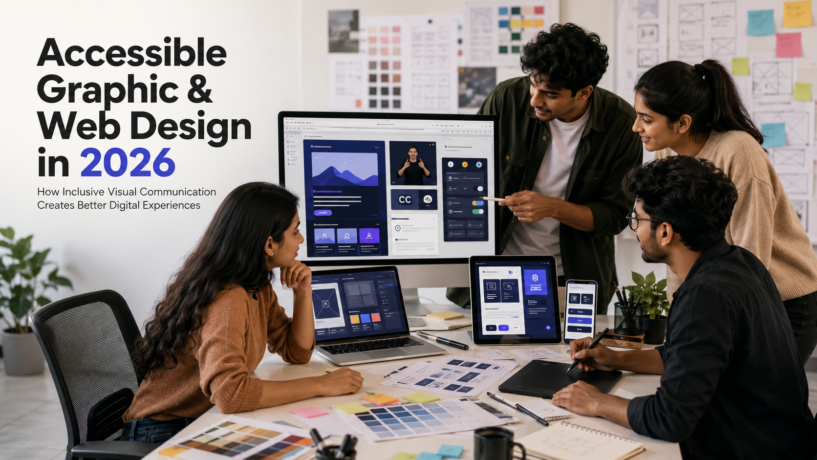
A beautifully designed website can still be difficult—or impossible—for many people to use.
A visitor with low vision may struggle to read pale text placed over a photograph. Someone who cannot use a mouse may be unable to reach the navigation menu. A person with colour-vision deficiency may not understand a chart that communicates information through red and green alone. Rapid animation may make another user uncomfortable, while an uncaptioned video may exclude someone who is deaf or watching without sound.
These are not simply technical problems. They are design problems.
Accessible graphic and web design aims to create visual communication and digital experiences that can be perceived, understood and operated by people with a wide range of abilities, devices and situations.
It does not require every website to look plain or identical. It requires designers to make intentional choices about colour, typography, hierarchy, imagery, interaction, motion and content.
For students entering graphic design, UI/UX design, web design, branding or digital communication, accessibility is becoming an essential professional skill rather than an optional specialisation.
The Web Content Accessibility Guidelines, commonly called WCAG, organise digital accessibility around four principles: content should be perceivable, operable, understandable and robust. WCAG 2.2 contains testable criteria at A, AA and AAA levels.
Understanding these principles can help young designers create work that reaches more people and performs better in real-world situations.
What Is Accessible Design?
Accessible design focuses on removing barriers that prevent people with disabilities from using a product, service, communication or environment.
In graphic and web design, this may include ensuring that:
- Text remains readable
- Information is not communicated through colour alone
- Images have meaningful text alternatives
- Videos include captions
- Navigation can be used without a mouse
- Interactive elements have a visible focus state
- Forms provide clear labels and error messages
- Content can be enlarged without becoming unusable
- Animation does not create unnecessary discomfort
- Page structure works with assistive technology
Accessibility benefits people with permanent disabilities, but its advantages extend much further.
Captions can help:
- Deaf and hard-of-hearing users
- People watching videos in a noisy environment
- Users in a quiet public place
- People learning a language
- Viewers who process written information more easily
High-contrast text can help:
- People with low vision
- Older users
- Someone using a phone in bright sunlight
- Users viewing a low-quality screen
Large clickable areas can help:
- People with limited hand movement
- Users with tremors
- Someone holding a phone with one hand
- People using a small touchscreen
This is why accessible design is often connected with inclusive design: solving barriers for one group can improve the experience for many others.
Accessibility, Usability and Inclusive Design
These terms are related, but they do not mean exactly the same thing.
Accessibility
Accessibility asks whether people with disabilities can perceive, understand, navigate and interact with the design.
It considers requirements such as:
- Screen-reader compatibility
- Keyboard navigation
- Colour contrast
- Captions
- Text alternatives
- Clear focus indicators
- Accessible forms
Usability
Usability asks whether a product is easy, efficient and understandable for its intended users.
A website may technically meet some accessibility requirements but still be confusing because of poor navigation or unclear content.
Inclusive Design
Inclusive design considers the diversity of human experiences from the beginning of the design process.
Microsoft describes inclusive design as a practice for people who create and manage products and services, with the objective of building experiences that allow broader participation.
Inclusive design may consider:
- Disability
- Age
- Language
- Culture
- Education
- Device limitations
- Internet speed
- Temporary injuries
- Situational limitations
A strong digital product should aim to be accessible, usable and inclusive rather than treating these as competing goals.
Why Accessible Web Design Is Trending in 2026
Accessibility is receiving greater attention because digital services now influence education, employment, banking, shopping, healthcare, transport and communication.
When an essential website or app is inaccessible, the effect is more serious than a minor visual inconvenience.
Several developments are increasing the importance of accessibility skills.
Updated International Standards
WCAG 2.2 builds on earlier versions of the Web Content Accessibility Guidelines and includes success criteria relating to focus visibility, dragging movements, target size, accessible authentication and consistent help.
Designers do not need to memorise every criterion before beginning their careers, but they should understand how visual and interaction decisions contribute to conformance.
European Accessibility Requirements
The European Accessibility Act establishes accessibility requirements for selected products and services, including areas such as e-commerce, banking and electronic communication. The European Commission states that the Act came into effect in June 2025.
Indian designers working for international companies or global clients may therefore encounter accessibility requirements even when they are based outside Europe.
Accessibility Guidelines in India
GIGW 3.0—Guidelines for Indian Government Websites and Apps—includes expanded guidance intended to make digital access more inclusive. Government organisations are expected to apply these guidelines to their web-based initiatives.
Although GIGW is specifically focused on government digital platforms, it demonstrates the growing importance of accessible and user-centred digital services in India.
More Diverse Digital Users
Digital products are used by people with different abilities, ages, languages, devices and levels of technical confidence.
A designer cannot assume that every user:
- Sees colour in the same way
- Uses a mouse
- Hears audio
- Reads small text comfortably
- Understands technical language
- Has a fast internet connection
- Uses the latest smartphone
- Can complete gestures quickly
- Processes information in the same way
Designing for real diversity is becoming a practical industry requirement.
Who Experiences Digital Accessibility Barriers?
Accessible design may support people with:
- Blindness
- Low vision
- Colour-vision deficiency
- Deafness
- Partial hearing loss
- Limited hand movement
- Tremors
- Paralysis
- Learning disabilities
- Dyslexia
- Attention-related differences
- Cognitive disabilities
- Photosensitive conditions
- Speech impairments
- Age-related changes
Disability may also be temporary or situational.
For example:
- A broken arm can make mouse use difficult.
- An eye infection may make bright screens uncomfortable.
- A commuter may be unable to hear a video.
- Bright sunlight may reduce screen visibility.
- Slow internet may prevent heavy visual content from loading.
- A new parent holding a child may have only one hand available.
Inclusive design examines these situations instead of designing only for an ideal user under perfect conditions.
The Four Principles of Web Accessibility
WCAG groups accessibility under four foundational principles.
1. Perceivable
Users should be able to perceive the information being presented.
This may require:
- Text alternatives for images
- Captions for video
- Sufficient colour contrast
- Resizable text
- Clear visual hierarchy
- Content that does not depend on one sensory method
For example, an error message should not be indicated only by turning a field border red. It could also include an icon and clear written explanation.
2. Operable
Users should be able to operate the interface.
This may include:
- Keyboard accessibility
- Visible focus indicators
- Sufficient time to complete tasks
- Large enough interaction targets
- Alternatives to complex gestures
- Navigation that helps users locate content
A website that can be explored only through a mouse may exclude users who navigate with a keyboard, switch device or voice control.
3. Understandable
Content and interaction should be predictable and easy to understand.
This includes:
- Clear language
- Consistent navigation
- Helpful instructions
- Descriptive labels
- Meaningful error messages
- Predictable interface behaviour
A creative interface should not force users to guess what every icon or gesture does.
4. Robust
Content should work reliably with different browsers, devices and assistive technologies.
Designers support robustness by creating clear component specifications and collaborating with developers who use appropriate semantic structure.
The visual designer may not write the final code, but design decisions can either support or obstruct accessible implementation.
Accessible Colour Design
Colour is one of the most powerful tools in graphic design, but it can also create barriers.
Do Not Communicate Meaning Through Colour Alone
Imagine a dashboard where:
- Green means approved
- Red means rejected
- Yellow means pending
A user who cannot distinguish these colours may miss the information.
A more inclusive design could combine:
- Colour
- Written status
- Distinct icons
- Different shapes or patterns
For example:
- Approved — checkmark icon
- Rejected — cross icon
- Pending — clock icon
This approach also helps when the interface is printed in grayscale or viewed on a poor-quality screen.
Maintain Sufficient Contrast
Contrast refers to the visual difference between foreground and background.
W3C explains that sufficient contrast helps people with moderately low vision or reduced contrast perception read text without specialised contrast-enhancing technology.
WCAG Level AA generally requires a contrast ratio of at least:
- 4.5:1 for standard-sized text
- 3:1 for qualifying large text
Interface elements and meaningful graphical objects also require appropriate non-text contrast in relevant situations.
Common contrast mistakes include:
- Light grey text on white
- White text over a bright photograph
- Pale placeholder text
- Low-contrast navigation
- Thin coloured text on a similar background
- Buttons that blend into the page
Designers should test actual colour values instead of judging contrast only by eyesight.
Avoid Difficult Text-on-Image Combinations
Text placed directly over photography can become unreadable when the background changes behind different letters.
Possible solutions include:
- A solid text panel
- A dark or light overlay
- A controlled gradient
- Moving text into clear negative space
- Using a separate content section
The solution should maintain readability across desktop and mobile layouts.
Design for Multiple Visual Modes
Some users prefer:
- Dark mode
- High-contrast mode
- Enlarged text
- Reduced transparency
- Custom browser colours
A design system should be tested under different settings rather than assuming that one visual theme suits everyone.
Accessible Typography

Typography affects readability, comprehension and visual hierarchy.
An accessible typographic system should consider more than font style.
Choose Legible Typefaces
A readable typeface generally includes:
- Clear letter shapes
- Distinguishable characters
- Adequate spacing
- Multiple useful weights
- Strong performance at small sizes
Decorative display fonts may be appropriate for large headings but should not be used for long paragraphs, instructions or form labels.
Use Comfortable Text Sizes
Text that is extremely small can become difficult for people with low vision, older users or anyone reading on a mobile device.
Designers should also ensure that content can enlarge without:
- Overlapping
- Disappearing
- Being cut off
- Requiring horizontal scrolling for ordinary text
- Breaking navigation
W3C’s preliminary accessibility checks include resizing text as an important part of review.
Maintain Line Length and Spacing
Very long lines are difficult to track, while extremely short lines interrupt reading rhythm.
Readable layouts generally use:
- Controlled paragraph widths
- Comfortable line height
- Visible paragraph separation
- Adequate spacing between headings and content
- Clear alignment
Avoid Large Blocks of All-Capital Text
All-capital letters can reduce word-shape recognition and make longer passages more difficult to scan.
They may be used selectively for short labels, but not as the default style for substantial text.
Create a Clear Heading Hierarchy
Users should be able to understand the page structure by scanning headings.
A good hierarchy distinguishes:
- Main page title
- Major sections
- Subsections
- Body content
- Labels
- Supporting information
Heading styles should not be based only on appearance. Designers should communicate the intended hierarchy to developers so it can be reflected in the underlying structure.
Accessible Images and Graphic Communication

Images can inform, persuade and create emotion. Their accessibility depends on purpose and context.
Meaningful Images Need Text Alternatives
An informative image should have a text alternative that communicates its purpose to people who cannot see it.
W3C includes image text alternatives among its basic accessibility checks.
Good alternative text should focus on information that matters in the context.
For example:
- Poor: “Image”
- Better: “Student draping red fabric on a mannequin”
- Context-specific: “Fashion student demonstrating asymmetrical draping during a garment-construction workshop”
Decorative images that add no meaningful information may be treated differently during implementation.
Avoid Embedding Important Text Inside Images
Text placed inside posters, banners or infographics may:
- Become unreadable when resized
- Be unavailable to screen readers
- Produce poor contrast
- Become pixelated
- Be difficult to translate
- Fail on smaller screens
Important information should also appear as real text outside the image.
Make Infographics Understandable
An accessible infographic should use:
- Clear headings
- Strong contrast
- Logical reading order
- Simple icons
- Direct labels
- Limited visual clutter
- Supporting text explanation
Complex data should be accompanied by a written summary or accessible table.
Design Charts Beyond Colour
Charts should differentiate data through:
- Labels
- Patterns
- Shapes
- Line styles
- Symbols
- Direct annotations
A legend that relies only on similar colours may not be sufficient.
Accessible Icons
Icons can reduce clutter, but unfamiliar icons may create confusion.
An accessible icon system should:
- Use commonly understood symbols where possible
- Pair unclear icons with text labels
- Maintain consistent meaning
- Provide sufficient contrast
- Avoid very thin strokes
- Remain recognisable at small sizes
- Include clear hover and focus states where relevant
A designer should not assume that every user understands a symbol simply because it appears modern.
For essential actions such as “Submit,” “Delete,” “Download” or “Pay,” visible text can reduce uncertainty.
Accessible Layout and Visual Hierarchy
A clear layout helps users predict where information is located.
Useful principles include:
- Consistent page structure
- Clear content grouping
- Visible headings
- Adequate whitespace
- Predictable navigation
- Limited visual competition
- Related actions placed together
- Important information shown before secondary content
Avoid Visual Overload
Too many colours, cards, promotional banners, pop-ups and animations can make a page difficult to process.
Visual simplicity does not mean removing all creativity. It means establishing a clear priority.
The designer should guide the user’s attention instead of making every element equally loud.
Use Responsive Layouts Carefully
A desktop layout should not simply shrink on mobile.
Designers should check whether:
- Text remains readable
- Buttons remain easy to select
- Navigation remains understandable
- Content order still makes sense
- Images do not hide essential information
- Tables have a usable mobile strategy
- Modal windows fit smaller screens
Mobile accessibility should be considered from the first wireframe.
Keyboard Navigation and Focus Design
Many users navigate websites without a mouse.
They may use:
- A keyboard
- Switch controls
- Voice commands
- Assistive input devices
When a user presses the Tab key, the interface should show which element currently has focus.
WCAG guidance explains that a visible and discernible focus indicator is important for keyboard users.
Designers should specify focus states for:
- Links
- Buttons
- Form fields
- Menus
- Tabs
- Cards with actions
- Dialog controls
A focus state should not be removed simply because a designer considers the default outline unattractive.
Instead, it can be redesigned using:
- A clear outline
- A high-contrast border
- An underline
- A background change
- A combination of indicators
Focus should remain clearly visible against different backgrounds.
Designing Accessible Buttons and Touch Targets
Buttons should look interactive and communicate what will happen when selected.
Useful practices include:
- Clear action labels
- Sufficient visual contrast
- Adequate size
- Space between adjacent controls
- Visible hover, active and focus states
- Consistent placement
- Avoiding vague labels such as “Click Here”
More descriptive labels include:
- Download Course Brochure
- Submit Application
- View Fashion Portfolio
- Book Counselling Session
Very small icons or tightly packed controls can be difficult for users with limited precision.
WCAG 2.2 includes requirements relating to target size and alternatives to dragging interactions.
Accessible Form Design
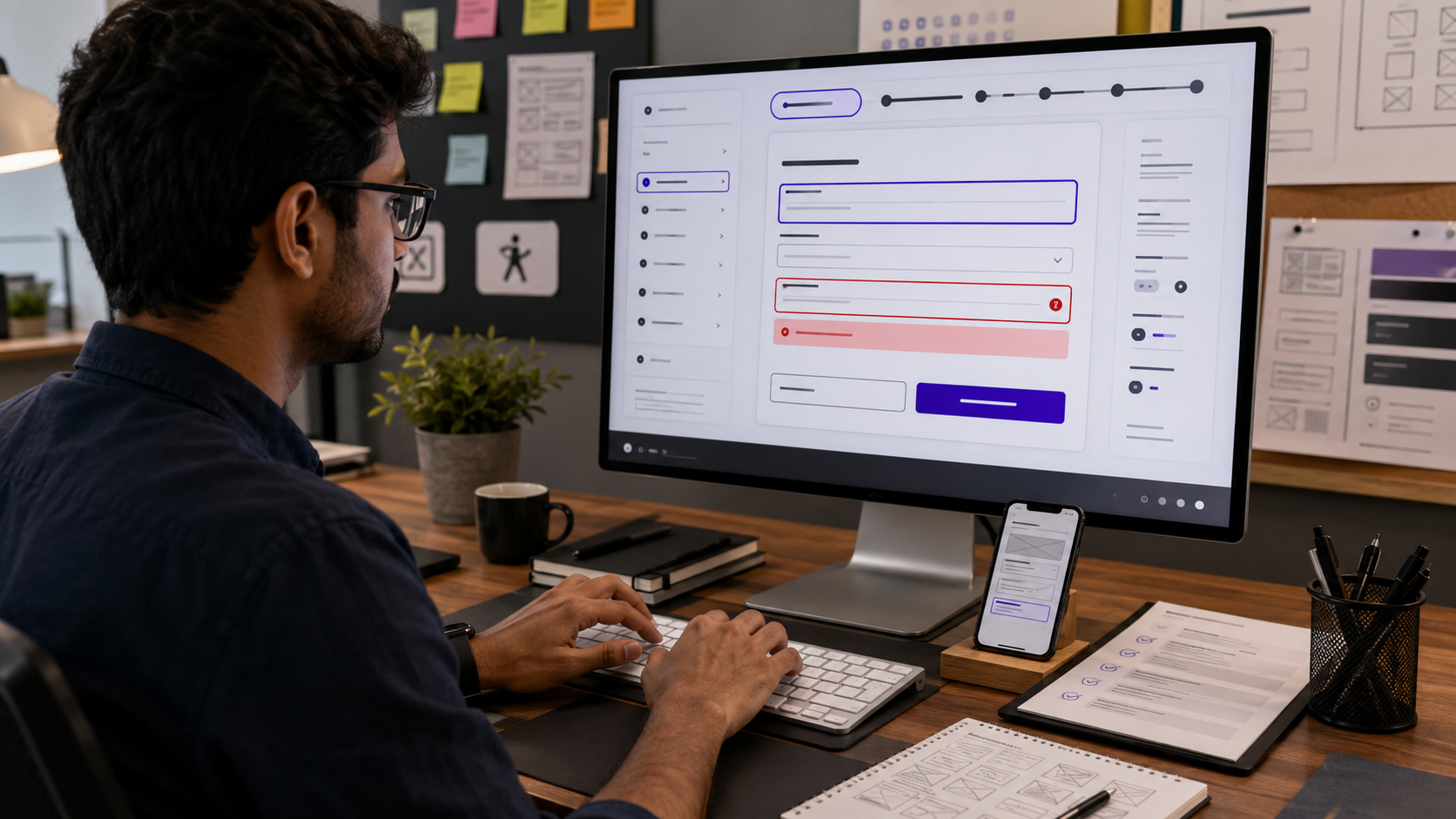
Forms are a common source of digital frustration.
An accessible form should include:
- Persistent field labels
- Clear instructions
- Logical field order
- Required-field indicators
- Helpful examples
- Specific error messages
- Visible focus states
- Sufficient time to complete the form
- Confirmation after submission
Do Not Use Placeholder Text as the Only Label
Placeholder text disappears when users type and may have poor contrast.
A visible label should remain available above or beside the field.
Explain Errors Clearly
Poor error message:
“Invalid input.”
Better error message:
“Enter a 10-digit mobile number without spaces.”
The error should identify both the problem and the way to correct it.
Preserve Entered Information
When possible, users should not be forced to re-enter every field after making one mistake.
Do Not Depend Only on Colour
An invalid field should not be indicated only by a red border. Add an icon and written explanation.
W3C’s basic accessibility checks include form labels and errors as a key review area.
Accessible Motion and Animation
Animation can guide attention and explain transitions, but excessive motion may create discomfort.
Potential problems include:
- Rapid flashing
- Continuous background motion
- Parallax effects
- Auto-playing carousels
- Unexpected zooming
- Large objects moving across the screen
- Animated content that cannot be paused
Designers should consider:
- Whether motion serves a clear purpose
- Whether it can be reduced or disabled
- Whether auto-playing content can be paused
- Whether important information remains available without animation
- Whether flashing could create a physical risk
A user’s reduced-motion preference should be respected during implementation.
Accessible Video and Audio
Video content should not assume that every user can hear the audio or see the visuals.
Depending on the content, accessibility may involve:
- Accurate captions
- Transcripts
- Audio descriptions
- Clear controls
- Pausing and replaying
- Avoiding unexpected auto-play
- Maintaining readable text overlays
- Ensuring controls can be used by keyboard
Captions should represent meaningful dialogue and audio information rather than being treated as decorative subtitles.
W3C includes multimedia alternatives among its basic accessibility review checks.
Plain Language and Content Design
Accessibility is not only visual.
Complex language, unexplained abbreviations and long paragraphs can make information difficult to understand.
Useful content-design practices include:
- Clear headings
- Short paragraphs
- Familiar words
- Direct instructions
- Descriptive links
- Lists where appropriate
- Important information placed early
- Consistent terminology
Instead of:
“Applicants are hereby advised to facilitate submission of the aforementioned documentation.”
Use:
“Upload the required documents before submitting your application.”
Clear language helps users with cognitive disabilities, new language learners and people reading quickly on a mobile device.
Designing Accessible Navigation
Navigation should remain consistent and predictable.
Users should be able to identify:
- Where they are
- What sections are available
- How to return
- What will happen after selecting a link
- How to skip repeated content
- How to close menus and dialogs
Avoid hiding essential navigation behind unclear gestures or unfamiliar symbols.
On mobile, a menu icon may be supported by a visible “Menu” label when greater clarity is required.
Accessibility in Graphic Design Beyond Websites
Accessibility also matters in:
- Posters
- Brochures
- Social-media posts
- Presentations
- Signage
- Packaging
- Infographics
- Digital advertisements
- Educational materials
- PDF documents
Social-Media Graphics
A social-media post should consider:
- Readable text size
- Strong contrast
- Limited text inside the image
- Captions for videos
- Alternative text where supported
- Avoiding rapid flashing
- Adding important information to the post caption
Presentations
An accessible presentation may use:
- Large readable text
- Simple slide structure
- High contrast
- Limited information per slide
- Meaningful image descriptions
- Captions for video
- Verbal explanation of charts
- Avoiding colour-only distinctions
Print Materials
Printed brochures and posters should consider:
- Font size
- Contrast
- Paper glare
- Logical reading order
- Clear contact information
- Sufficient whitespace
- Plain language
Accessibility should not be limited to digital screens.
Accessibility and Brand Identity
Some designers worry that accessibility will weaken a brand’s visual personality.
In practice, accessibility can strengthen a brand system by making it:
- More consistent
- Easier to recognise
- More flexible
- More readable
- More professional
- More usable across platforms
A brand guideline can specify:
- Approved high-contrast colour combinations
- Minimum text sizes
- Accessible typefaces
- Button and link states
- Icon rules
- Image-overlay rules
- Motion principles
- Alternative logo versions
- Dark-mode palettes
A brand does not lose creativity when it becomes accessible. It gains the ability to communicate more effectively.
Designing Accessibility into a Design System
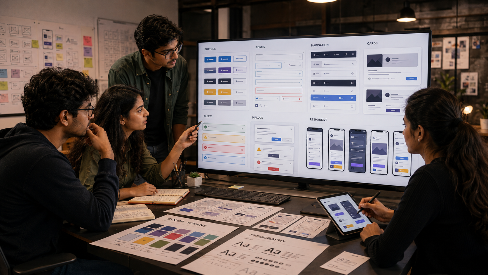
A design system is a reusable collection of components, styles and rules.
Accessibility should be built into components such as:
- Buttons
- Form fields
- Menus
- Cards
- Alerts
- Dialogs
- Tabs
- Tooltips
- Navigation bars
Each component can define:
- Default state
- Hover state
- Active state
- Focus state
- Disabled state
- Error state
- Contrast requirements
- Responsive behaviour
This reduces the need to solve the same accessibility problem repeatedly.
The Role of Graphic Designers and UI/UX Designers
Accessibility is a shared responsibility.
Graphic Designers May Contribute Through:
- Colour systems
- Typography
- Iconography
- Image treatment
- Layout
- Infographics
- Brand guidelines
- Social-media templates
UI Designers May Contribute Through:
- Component states
- Interaction patterns
- Responsive layouts
- Focus indicators
- Forms
- Navigation
- Visual feedback
UX Designers May Contribute Through:
- User research
- Information architecture
- Task flows
- Prototyping
- Usability testing
- Inclusive personas
- Content structure
Developers May Contribute Through:
- Semantic code
- Keyboard behaviour
- Assistive-technology support
- Accessible component implementation
- Performance
- Technical testing
Accessibility is most effective when it is discussed from the beginning rather than checked only after development is complete.
Why Automated Accessibility Tools Are Not Enough

Automated tools can identify issues such as:
- Some contrast failures
- Missing alternative text
- Empty form labels
- Structural errors
However, they cannot fully determine whether:
- Alternative text is meaningful
- Navigation is understandable
- Content language is clear
- Focus order is logical
- An animation is distracting
- A form is easy to complete
- The overall user journey makes sense
W3C’s evaluation guidance includes both basic checks and human review of page structure, interaction and content.
The strongest process combines:
- Automated checks
- Keyboard testing
- Screen-reader testing
- Zoom and responsive testing
- User testing with disabled participants
- Manual design review
Accessible Design and Artificial Intelligence
AI tools can help designers generate layouts, images, colour palettes and content, but their outputs should not be assumed to be accessible.
AI-generated work may include:
- Low-contrast text
- Incorrect reading order
- Decorative but unclear icons
- Images containing distorted text
- Inaccurate alternative text
- Visually complex layouts
- Biased assumptions about users
Designers remain responsible for reviewing the output.
AI may assist accessibility by:
- Suggesting alternative text
- Identifying contrast issues
- Creating captions
- Simplifying content
- Generating multiple layout options
- Supporting personalisation
However, AI recommendations require human verification, context and user testing.
Accessibility should not be treated as an automatic filter applied after the creative work is finished.
A Student Process for an Accessible Web-Design Project
Step 1: Select a Real Problem
Possible projects include:
- Accessible college-admission website
- Inclusive fashion e-commerce store
- Public-transport information app
- Accessible healthcare appointment portal
- Museum website
- Online-learning dashboard
- Event-booking platform
- Government-service interface
Step 2: Research Diverse Users
Include users who may experience:
- Low vision
- Colour-vision differences
- Limited motor control
- Hearing loss
- Cognitive overload
- Low digital confidence
- Slow internet
Avoid assuming that one disabled person represents an entire community.
Step 3: Identify Accessibility Barriers
Audit the existing experience for:
- Poor contrast
- Small text
- Missing labels
- Confusing navigation
- Inaccessible forms
- Colour-only information
- Unclear focus states
- Auto-playing content
- Complex language
Step 4: Develop a Clear Information Structure
Organise content using:
- Logical navigation
- Clear headings
- Short pathways
- Predictable labels
- Visible priorities
Step 5: Build an Accessible Visual System
Define:
- Colour combinations
- Typography
- Spacing
- Icon rules
- Image treatment
- Component states
- Responsive behaviour
Step 6: Create Interactive Prototypes
Include:
- Keyboard focus sequence
- Error states
- Hover states
- Loading states
- Confirmation messages
- Mobile views
- Enlarged-text views
Step 7: Test the Design
Test through:
- Contrast tools
- Keyboard-only navigation
- Screen enlargement
- Grayscale viewing
- Mobile devices
- Different lighting conditions
- User feedback
Step 8: Document Accessibility Decisions
A strong portfolio should explain:
- What barriers were found
- Who was affected
- Which standards were considered
- How the design changed
- What testing was performed
- What still requires developer implementation
This demonstrates design reasoning rather than merely showing attractive screens.
Accessible Design Portfolio Project Ideas
Students can create:
- An accessible fashion-shopping app
- A colour-blind-friendly data dashboard
- A multilingual public-service website
- A caption-first video platform
- An accessible college-admission portal
- A dyslexia-friendly reading interface
- An inclusive healthcare-booking system
- An accessible design system
- A museum guide for visitors with different abilities
- A low-bandwidth educational platform
A portfolio case study should include:
- Research
- User needs
- Accessibility audit
- Wireframes
- Colour and type tests
- Component states
- Keyboard-flow planning
- Error handling
- Responsive screens
- Testing results
- Final reflection
Career Opportunities in Accessible Design
Accessibility skills can support careers such as:
- Graphic Designer
- UI Designer
- UX Designer
- Web Designer
- Product Designer
- Design-System Designer
- Accessibility Consultant
- Inclusive-Design Researcher
- UX Writer
- Digital Content Designer
- Accessibility Tester
- Government Digital-Service Designer
A designer does not need to become a legal or technical specialist before applying accessibility principles. However, knowledge of standards and collaboration with specialists can make the designer more valuable to multidisciplinary teams.
Common Accessible-Design Mistakes
Adding Accessibility at the End
Late corrections may require redesigning colours, components, navigation and content.
Assuming Accessibility Makes Design Boring
Accessible design can still be expressive, experimental and visually distinctive.
Depending Only on an Accessibility Plugin
An overlay or plugin cannot automatically repair every structural, content and interaction problem.
Testing Only with a Mouse
Keyboard interaction may reveal barriers that mouse users never notice.
Using Placeholder Text as Form Labels
The label disappears as soon as the user begins typing.
Removing Focus Outlines
This can make navigation difficult for keyboard users.
Communicating Through Colour Alone
Status, errors and data should include additional indicators.
Writing Alternative Text for Every Decorative Detail
Alternative text should communicate relevant purpose, not create unnecessary noise.
Treating Disabled Users as One Group
Different users experience different barriers and may prefer different solutions.
Copying a Checklist Without User Testing
Standards are essential, but human experience must also be evaluated.
A Practical Accessibility Checklist for Design Students
Before presenting a digital project, ask:
Colour and Typography
- Is the text-background contrast sufficient?
- Is important information understandable without colour?
- Can body text be read comfortably?
- Does the design survive text enlargement?
- Are heading levels visually clear?
Images and Media
- Have meaningful images been planned for alternative text?
- Is important text available outside images?
- Do videos need captions or transcripts?
- Can users pause moving content?
Interaction
- Is every action reachable without a mouse?
- Is keyboard focus visible?
- Are buttons large and clearly labelled?
- Are hover states supported by focus states?
- Is there an alternative to dragging?
Forms
- Does each field have a persistent label?
- Are instructions clear?
- Are errors specific and easy to correct?
- Is information preserved after an error?
Layout
- Is navigation consistent?
- Is the reading order logical?
- Does the mobile layout remain usable?
- Is visual clutter controlled?
- Are dialogs easy to close?
Content
- Is the language direct?
- Are links descriptive?
- Are important instructions easy to locate?
- Are abbreviations explained?
This checklist is a starting point, not a substitute for reviewing the full applicable standard.
The Future of Accessible Visual Communication
Accessible design is likely to become more deeply integrated into:
- Design software
- AI-assisted workflows
- Component libraries
- Brand systems
- Education
- Procurement
- Government services
- International client requirements
- Product testing
Future designers may work with interfaces that adapt according to:
- Text-size preferences
- Motion sensitivity
- Contrast needs
- Input method
- Hearing preferences
- Language
- Cognitive load
- Device conditions
Personalisation can improve accessibility, but it should not replace a strong accessible foundation.
The objective is not to create a separate version of the internet for disabled users. It is to create flexible digital experiences that respect human diversity from the beginning.
Why Design Students Should Learn Accessibility
Accessible design teaches students to think beyond appearance.
It develops:
- Visual discipline
- User empathy
- Clear communication
- Interaction thinking
- Research ability
- Problem-solving
- Collaboration
- Technical awareness
- Ethical responsibility
- Portfolio differentiation
A designer who understands accessibility does not simply ask:
“Does this screen look attractive?”
They also ask:
- Can people read it?
- Can they navigate it?
- Can they understand it?
- Can they complete the task?
- Who might be excluded by this decision?
- How can the design offer another way?
These questions lead to stronger design.
Conclusion
Accessible graphic and web design is becoming an essential part of modern visual communication.
Colour, typography, images, animation, navigation and interaction can either remove barriers or create them. Accessibility therefore cannot be left entirely to developers or added as a final technical check.
Graphic designers, UI/UX designers, content creators and developers must work together to build digital experiences that are perceivable, operable, understandable and robust.
For design students, accessibility offers both a responsibility and an opportunity. It makes projects more useful, expands the audience and demonstrates mature professional thinking.
The future of digital design will not be defined only by new visual styles or technologies. It will also be defined by whether people with different abilities can participate.
The most successful design is not simply the design that attracts attention.
It is the design that allows more people to access, understand and use what has been created.